 |  |  |
I finally finished my printmaking project! Shortly after starting this project I realized that patience would be key. There were many steps to complete in this project that took thought, time, and detailed planning.
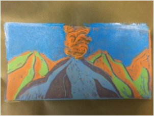
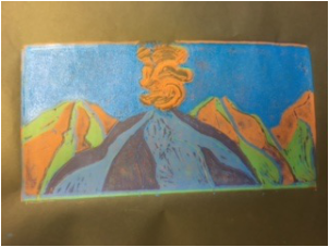
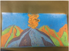
When the class was first assigned this project I knew that I wanted to print something original and different compared to what my peers were printing. I chose to print Mount St. Helens and I decided to add more to the piece by incorporating rigid lines, texture, detail, and a different color scheme. After cutting out my design i began to print. Before each print I always printed a practice print on a separate piece of paper to check the color, alignment, and cutting depth.
I really enjoyed this project. I enjoyed the printing process and the fact that each layer was put on separately but when each layer was applied it formed one complete picture. One aspect that stands out to me the most in this project is the color. I used 7 colors including my background color which was black. I usually am a very "classic" person and prefer for items to remain the color that they are, but with this project I am very happy that i decided to switch it up a bit. I personally think that the difference in color adds to the quality of the piece and it draws people in because its different but you can still distinctly tell what the object is. Due to all the colors I used in the project I decided to name my piece "Colored Mountains." I felt that this was a suiting title for my mountain scene printing.
Other than the fact that this assignment was very time consuming that hardest part was figuring out which layers to cut and which layers to keep un-cut. The piece's final look is dependent on what the artist does and at what time. It was also very difficult to line the paper and the design.
During the process of this piece I had many "what if's." What if I shouldn't do that? What if the colors should be natural? What if the design and paper don't align? What if there's not enough scenery? What if, what if, what if. After asking myself these questions and going back and forth between different ideas I began to ask myself "what if it works?" I think that as an artist it is very important to embrace your mistakes. I was worried about the colors, and now looking back on my art that's one of my favorite concepts of the piece. I was worried about the alignment, and yes there are parts of my prints where you can see the underneath colors....but I think that it add to the "colored mountains." Instead of a mistake the viewer and artist see a pop of color.
Looking back on my print if I could change and alter any of it I would change the background paper to a light blue. In the beginning I chose black to still incorporate the "darkness" and mystery of Mount St. Helens, but I wish that the black paper didn't dull the brightness of the colors as much as it did. With a lighter background color the colors would be more vibrant.
Overall I am very happy with how my final turned out. I'm also excited that I learned a new art technique and that I will now be able to apply these techniques and experiences to other projects and assignments that I may come across.
Thank you Mrs. Rossi for all the techniques you have taught me this year and the projects that we completed this year. I feel that I have grown as in artist in the fact that I have learned new techniques through prisma colored pencils, water color, clay, canvas painting, multimedia, pastel - oil and chalk, and now printing. I have also grown in my art vocabulary and drawing skills. I now look at an object and focus on its shadow, depth, and roundness.
Thank you for a great semester!
Written By: Zoe Lukas
 RSS Feed
